“What you think which one is a better option if you want to express Something,” Thousand of words or various Types of charts in statistics. A good graph or chart can show as many as several paragraphs of words. But how can you decide which graph style to use? In mathematics and statistics, various forms of graphs are used to display data in a graphical format. The most popular and widely used types of charts or graphs that we will discuss in this blog. We are very sure that you will get to know more about statistics and also where and how to use various types of charts in statistics.
Charts and graphs support the presentation of complex material in a straightforward manner. They can improve the clarity and effectiveness of your message by adding value to your online presentations and meetings.
There are numerous chart and graph formats from which to pick. To choose the right type, it’s important to understand how each one is made and what kind of data it stores. Are you attempting to draw attention to a pattern? Do you want to present your data as a percentage or illustrate the overlap of data sets?
On the other hand, if you are looking for a statistics assignment helper, don’t worry you can get the best statistics assignment help from our experts. So, what are you waiting for get help now!
You’ll be able to choose the chart or graph that best supports your thesis once you understand the unique type of data that each one can handle. Let’s First brief what statistics is, then will move to types of charts in statistics.
What are statistics?
Table of Contents
Statistics is a branch of mathematics concerned with the collection, analysis, and presentation of numerical data. Statistics is the study of data from a population to meaningfully characterize it, draw inferences, and make well-informed judgments.
A community, an organization, a production line, a service counter, or a natural event such as the weather can all be considered a population. Statisticians evaluate which quantitative model is appropriate for a certain situation and what types of data should be collected and analyzed. The application of broad techniques to specific situations is referred to as applied statistics.
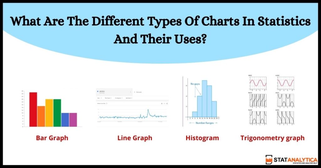
You’ll need a decent understanding of how graphs and charts to function to figure this out. Line graphs, bar graphs, pie charts, and Venn diagrams are four of the most popular types covered in this blog. We will also discuss some other Different types of charts in statistics.
What are the different types of charts in Statistics?
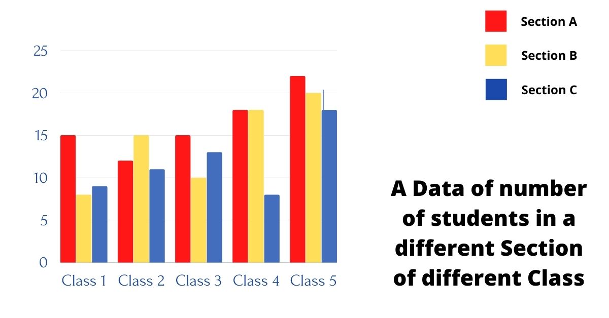
1. Bar Chart
Most of the companies use bar charts because one of the most used data visualizations is bar charts. They can be used to swiftly compare data across categories, emphasize discrepancies, disclose historical highs and lows, and indicate trends and outliers. When you have data that can be divided into several categories, bar charts are handy. This is one of the most Useful Types of charts in statistics.
A bar graph can be managed vertical or horizontal. The length or height of the bars on a bar graph is crucial—the longer or higher the bar, the higher the value.
Bar graphs are one of many visual data presentation approaches that allow the viewer to quickly spot patterns or trends.
Categorical and numeric variables are frequently arranged in class intervals in bar graphs. They are made up of an axis and a succession of horizontal or vertical bars that are labeled. For example, Solitaired.com presented their findings on top classic games using horizontal bar. They used the bars to specify the labeling and even split their bar chart into two to make room for more data. The bars represent the frequency of various values of a variable, or simply the multiple values themselves. The scale refers to the numbers on the x-axis of a bar graph or the y-axis of a column graph. Let’s take an example.

2. Line Chart
The line chart, also known as a line graph, joins multiple data points to portray them as a single continuous progression. Line charts are used to visualize data trends, usually across time (like stock price changes over five years or website page views for the month). As a result, there’s a simple, plain way to see how one value changes concerning another.
Line graphs are generally used to trace changes across time, both short and long. When there are fewer changes, line graphs are preferable when we compare them to bar graphs. Many people use Line graphs to compare changes for multiple groups over the same time period. Both bar and line graphs play an essential role in the types of charts in statistics that are used most of the time.
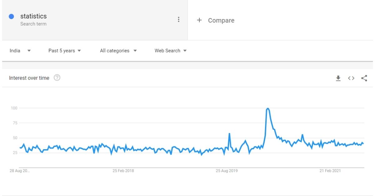
A line graph of statistics over the time
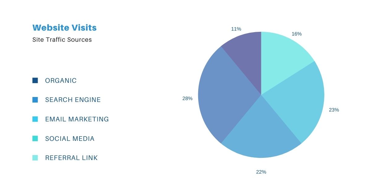
3. Pie Chart
A pie chart is a circular representation of the statistical graphic, which is divided into various slices to show all the desired data in numerical proportions. Each slice’s arc length (and thus its central angle and area) in a pie chart is equal to the quantity it represents.
Pie charts can be used to provide depth to other visualizations. A pie chart by itself does not allow the reader to compare data fast and properly. Key points from your data are missed since the reader must generate context on their own. Rather than making a pie chart the centerpiece of your dashboard, use it for diving down into different visualizations. Let’s take an example of Websites to visit in different ways.
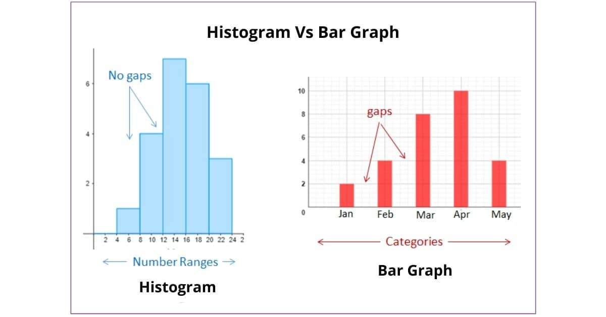
4. Histogram
A popular graphing tool is a histogram. It’s used to summarise data that are either discrete or continuous and measured on an interval scale. A histogram is a graphical representation that divides data points into ranges defined by the user. By grouping multiple data points into logical ranges or bins, the histogram, which resembles a bar graph, condenses a data series into an easily understandable visual. It is frequently used to visualize the significant features of the data distribution in a convenient format. Some types of charts in Statistics seem similar, but they have different Visuals. For example, let’s compare histograms and bar graphs.
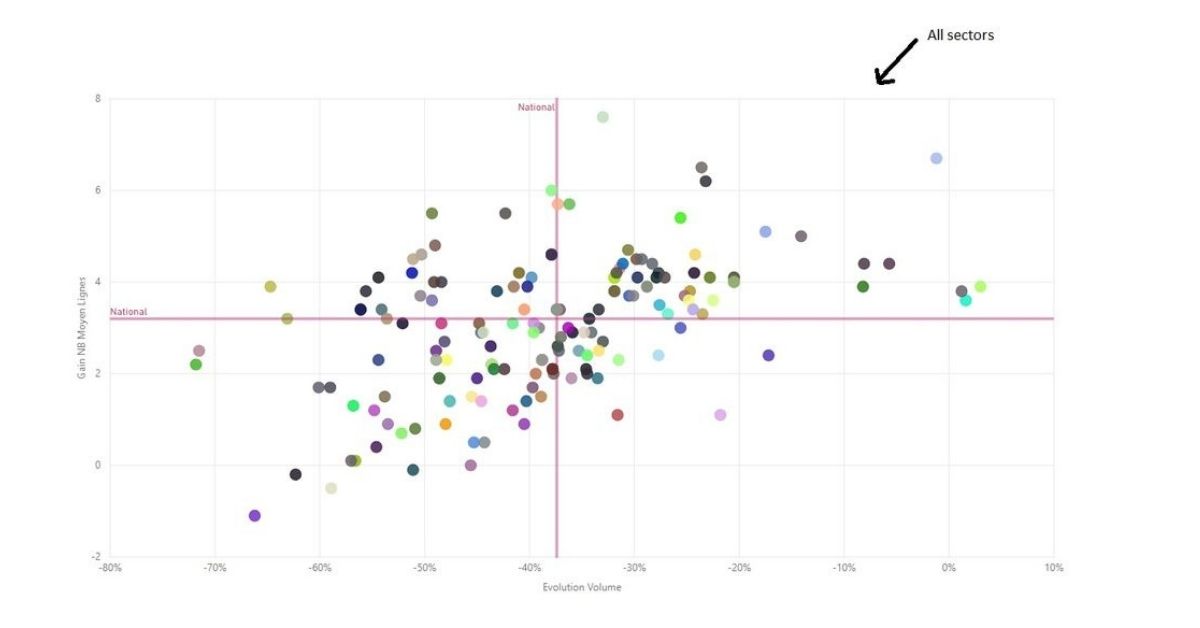
5. Scatter Plot
In a Scatter plot, different colors of Dots are used to represent values for two different numeric variables. The values for each data point are shown by the position of each dot on the horizontal and vertical axes. These Scatter plots are used to show that how different variables relate to each other.
Scatter plots are helpful in examining the relationship between two or more variables, revealing whether one is a good predictor of the other or whether they tend to vary independently. On a single chart, a scatter plot displays a large number of different data points. After that, you may add analytics like cluster analysis or trend lines to the graphic.
6. Exponential Graphs
The Study of exponential functions using a table of values and drawing all the points on graph paper is known as exponential graphs. It’s worth noting that exponential functions are logarithmic functions’ inverses. Based on the function, the graph of exponential charts can be a rising or decreasing form of a curve.

Exponential Graphs
The term “exponential growth” refers to a process in which quantity Exponentially rises with time.
7. Trigonometric Graphs
The sine function, cosine function, tangent function, cotangent function, cosec function, and sec function are among the six trigonometric functions displayed here. To understand more about the graphs of each function, as well as their maximum and lowest values and solved instances, refer to trigonometry graphs. With the help of the corresponding graph, the graphical representation functions are simply described here. Students need to know the period, phase, amplitude, maximum, and lowest turning points to build the trigonometry charts. In many fields of engineering and research, these graphs are employed.
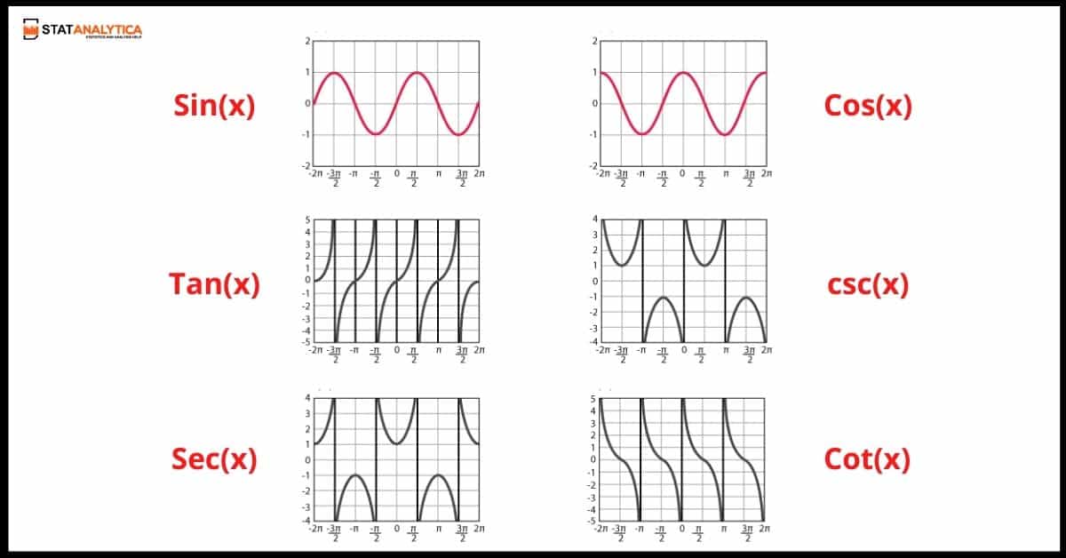
Trigonometry graph for all the waves
8. Logarithmic Graphs
Logarithmic functions are just the Opposite of Exponential functions, and the graphing methods are comparable. To plot logarithmic graphs, first, create a table of values, then plot the points on graph paper accordingly. Any log function’s graph will be the inverse of an exponential function’s graph. The logarithmic function is y = log b x which is the inverse of the Expomemtial function i.e y = b x
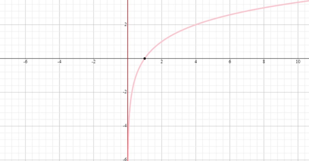
Logarithmic Graphs
What makes Charts or Graphs Better to understand?
Visual representations in the form of charts or images help us to understand data Easily and quickly. Whenever anyone needs to show an effective chart or graphs, especially in statistics, the report, or presentation, it becomes very clear to everyone, and also makes it easy to understand all the basic facts when you’re analyzing sales numbers or focusing on a trend.
But you have to think about which kind of chart or graph you should choose. When you click on the chart option in your spreadsheet program, you’ll see many styles through which you can easily represent all the desired data to everyone. They all look good, but which one will suit you or works best for your data and for your viewers? Here you have to analyze all the data, and you have to think about which charts will show you a better presentation for your work.
Conclusion
I hope you learn some important details about statistics and types of charts in statistics. Stay tuned to Statanalytica for more statistics-related articles and to better understand the ideas. Students can obtain help with a variety of programming languages as well as our numerous assignment services, such as Statistics homework help and R programming assignment help, at Statanalyica.
FAQs
Q1. What is the basic use of three most common types of charts in statistical?
Bar graphs are used to display numbers that are unrelated to one another.
Pie charts are used to depict how a whole is broken into sections.
Line graphs demonstrate the evolution of numbers over time.
Q2. What’s the best way to make a color-coded scatter plot?
On our scatterplot, we want each group to be represented by a different color.
1. The First Step is to prepare the data. Depending on which category the data point belongs to, divide the Y column into three columns: A, B, and C.
2. The Second Step is to create the scatterplot. Choose an empty scatterplot from the Insert menu.
3. The Third Step is to Adjust the colors.