The modern educational landscape is a vibrant and complex ecosystem, brimming with data. From student performance metrics and attendance records to financial reports and faculty evaluations, schools and universities generate an immense volume of information every single day. For decades, this treasure trove of data was often trapped in a fragmented web of spreadsheets, manual reports, and siloed systems, making it nearly impossible to gain a unified, real-time view of an institution’s health.
But a new, glorious era has dawned. The use of BI dashboards in schools and universities is not just a trend; it is a profound and positive transformation. These powerful tools are acting as a magnificent command center, collecting, analyzing, and visualizing crucial data to create a single source of truth. By empowering educators and administrators with brilliant, actionable insights, BI dashboards are helping institutions achieve a level of excellence and efficiency that was once unimaginable. They are the key to unlocking true potential, ensuring every decision is strategic, every student is supported, and every resource is optimized for success.
The Data Deluge: Why Traditional Methods Are Falling Behind
Table of Contents
Imagine a school administrator drowning in a sea of paper reports. One file contains attendance data, another holds test scores, a third has information on teacher performance, and a separate folder is dedicated to budget spreadsheets. To understand the relationship between student attendance and academic performance, they would have to manually cross-reference data, a time-consuming and often inaccurate process. This is the reality of traditional educational management—a reality defined by fragmented data and reactionary decision-making.
This manual, cumbersome approach has significant drawbacks. It creates silos, where departments like admissions, academics, and finance operate independently, unable to see how their actions impact the whole. It leads to delayed insights, meaning that by the time a problem is identified, it may be too late to implement an effective intervention. In today’s fast-paced world, where adaptability is paramount, relying on outdated methods means institutions are constantly playing catch-up, missing crucial opportunities to innovate and improve.
The Golden Age of Educational Analytics: What are BI Dashboards?
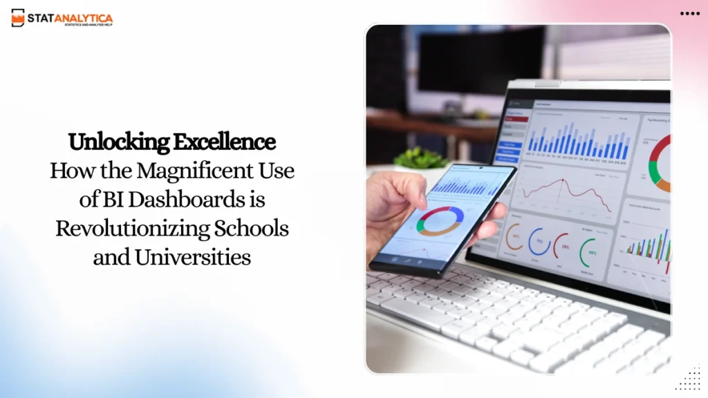
At its core, a business intelligence (BI) dashboard is a data visualization tool that acts as a dynamic interface for an organization’s most important metrics. For educational institutions, a BI dashboard is a brilliant, interactive hub that brings together disparate data from various sources—such as Student Information Systems (SIS), Learning Management Systems (LMS), and financial software—into a unified, intuitive view. Instead of sifting through thousands of rows in a spreadsheet, stakeholders can see a vivid, real-time snapshot of performance, trends, and opportunities.
These dashboards go far beyond simple reporting. They are equipped with intelligent features that make data accessible and meaningful to everyone, from teachers to university deans.
Key Features of an Amazing BI Dashboard
- Real-time Data Visualization: Instantly see the latest information presented in easy-to-understand charts, graphs, and heatmaps.
- Interactive and Customizable Reports: Drill down into specific data points or filter by class, grade, or department to get detailed insights.
- Predictive Analytics: Use historical data to forecast future trends, such as enrollment numbers or student success rates.
- Secure and Collaborative Sharing: Share dashboards with relevant staff and faculty in a secure, controlled environment, promoting a culture of transparency and collaboration.
- Mobile Accessibility: Access critical data anytime, anywhere, allowing for swift, informed decisions on the go.
The adoption of these technologies is an absolute game-changer, fostering a culture of data-driven decision-making in education that is proactive, precise, and powerful.
Transforming the Classroom: Empowering Educators and Students
The most immediate and magnificent impact of BI dashboards is felt directly in the classroom. They transform a teacher’s role from a reactive problem-solver to a proactive coach, armed with precise data to support every student’s unique journey.
The Student Success Dashboard: A Magnificent Tool for Personalization
A student performance dashboard is a truly revolutionary tool for any educator. It provides a holistic view of each student’s academic health at a glance. Teachers can track key performance indicators (KPIs) such as grades, attendance, assignment completion rates, and participation. By seeing a student’s progress over time on a single screen, an educator can spot trends and identify patterns that might otherwise be missed. For example, a dashboard might reveal that a student’s grades are consistently excellent but their engagement in class discussions is low, prompting the teacher to offer a different form of participation.
Proactive Intervention and Enhanced Learning
One of the most powerful benefits of a student success analytics dashboard is its ability to enable early intervention. By setting up automated alerts, the system can flag “at-risk students” who show early signs of struggling—for example, a sudden drop in quiz scores or a decrease in attendance. This brilliant capability allows counselors and teachers to reach out with targeted support, a one-on-one meeting, or a referral for tutoring, all before the student falls significantly behind. This proactive approach is directly linked to higher student retention and, most importantly, improved academic outcomes. It replaces guesswork with certainty, ensuring no student is left to struggle alone.
Revolutionizing Curriculum and Teaching Strategies
Beyond individual student insights, BI dashboards aggregate data to reveal patterns across an entire class, grade, or subject. A curriculum analytics dashboard can help faculty identify specific topics or modules where a majority of students are underperforming. Is there a particular chapter that consistently receives low test scores? This insight prompts educators to re-evaluate their teaching methods, adjust the curriculum, or provide additional resources. This continuous feedback loop ensures that the teaching and learning process is constantly refined and optimized for the greatest impact. The result is a more effective, dynamic, and ultimately successful educational environment.
Revolutionizing School Management: From the Dean’s Office to the Boardroom
The use of BI dashboards in schools and universities extends far beyond the classroom, providing administrators and leaders with the strategic clarity needed to guide their institutions toward a brilliant future.
Strategic Decision-Making with Unprecedented Clarity
For principals, deans, and university presidents, having a holistic view of the institution is paramount. A BI dashboard provides this top-level perspective, allowing for informed, strategic decisions that were once based on intuition or outdated reports. It transforms complex, institutional-level data into a simple, digestible format, enabling leaders to manage and optimize everything from enrollment to budget allocation.
Here’s a table outlining the key administrative insights gained from a comprehensive BI dashboard:
| Metric Category | Key Insights Gained from BI Dashboards |
| Enrollment & Admissions | Predict future enrollment trends to plan resources and staffing. Analyze recruitment campaign effectiveness and identify high-yield recruitment channels. |
| Financials & Budgeting | Track budget versus actual expenditure in real-time. Optimize resource allocation by identifying spending inefficiencies and redirecting funds to high-impact programs. |
| Resource Utilization | Monitor usage of campus facilities like labs, libraries, and dorms. Ensure assets are being used efficiently to justify future investments. |
| Faculty & Staff Performance | Evaluate teaching effectiveness, identify areas for professional development, and ensure a balanced workload across departments. |
A Powerful Pathway to Operational Excellence
In addition to strategic planning, BI dashboards bring a new level of operational efficiency to day-to-day school management. They automate the creation of routine reports that once consumed countless hours of staff time. By consolidating data from different departments—admissions, finance, human resources, and facilities—dashboards break down organizational silos and streamline processes. This means administrators can focus their valuable time and energy on strategic initiatives, like improving student support services or developing innovative academic programs, rather than being bogged down in manual data collection and analysis. The result is a more agile, productive, and harmonious institution.
A Glimpse into the Future: Case Studies of Triumph and Success
To truly appreciate the power of BI dashboards, it’s essential to see their impact in action. Here are a couple of examples that showcase their transformative power.
Case Study 1: Transforming a University’s Student Retention
A large public university was facing a significant challenge: a high freshman dropout rate. They had a wealth of data on student performance, but it was scattered across their student information system and various department-specific databases. They decided to implement a comprehensive BI dashboard to gain a unified view of the student journey. The dashboard was configured to track student success analytics, including key indicators like attendance at orientation, library check-outs, course registration patterns, and engagement levels within the LMS.
The results were astonishing. Within the first semester, the dashboard’s predictive analytics models flagged hundreds of disengaged students who were at a high risk of dropping out. These insights were automatically routed to academic advisors, who could then proactively reach out to these students to offer support, mentorship, and resources. This brilliant, data-driven intervention led to a remarkable increase in student retention and a significant improvement in overall student well-being and academic achievement.
Case Study 2: An Urban School District’s Budget Optimization
A large urban school district was faced with budget cuts and needed to make difficult but equitable decisions about resource allocation. Instead of relying on anecdotal evidence or political pressure, they leveraged a BI dashboard to visualize their entire financial and academic landscape. The dashboard integrated data on per-school spending, student-teacher ratios, and academic outcomes across all 50 schools.
The dashboard provided irrefutable data that revealed a disparity in outcomes and resource use. It clearly showed which programs were delivering the highest academic returns and where funds were being underutilized. Armed with this knowledge, the district was able to make informed, transparent decisions to redirect funds from low-impact administrative areas to high-impact academic programs. This led to more equitable and enhanced outcomes for all students, proving that data-driven decisions are the foundation of fairness and success.
Choosing the Right BI Solution: Your Magnificent Journey to Data-Driven Education
The path to a data-driven educational institution is a magnificent journey, and choosing the right BI solution is the first critical step. It’s not about selecting the most expensive or complex software; it’s about finding a solution that fits your institution’s specific needs, budget, and technical capabilities.
Key Considerations for Your Magnificent Journey
- Ease of Integration: Ensure the BI tool can seamlessly connect to your existing systems (SIS, LMS, ERP, etc.) without requiring a massive overhaul.
- Customization and Flexibility: The tool should allow for the creation of custom dashboards and reports tailored to the unique needs of different departments—from a class-level academic performance dashboard for teachers to a high-level budget dashboard for administrators.
- Security and Data Privacy: Look for a solution with robust security features to protect sensitive student and faculty data, ensuring compliance with privacy regulations.
- Scalability and Cost: Choose a solution that can grow with your institution, whether you are a small school district or a large university, and offers a transparent pricing model.
- Support and Training: Opt for a provider that offers excellent support and comprehensive training resources to ensure a smooth transition and rapid adoption by all staff.
A Brilliant Tomorrow: Embrace the Power of BI Dashboards
The use of BI dashboards in schools and universities represents a glorious new chapter for the education sector. It is the brilliant fusion of technology and human potential, where data is no longer a burden but a powerful tool for enlightenment and progress. By embracing this transformative technology, educational institutions can move from a state of reactionary management to proactive leadership, making every decision more intelligent and effective.
The future of education is here, and it is powered by data. Embrace the incredible potential of BI dashboards to empower your educators, elevate your students, and lead your institution toward a future defined by remarkable success and unwavering excellence.
Also Read: Tableau vs Power BI for Data Visualization: Which Tool Reigns Supreme?
What is the main benefit of using a BI dashboard in an educational setting?
The primary benefit is transforming raw, disconnected data into clear, actionable insights. Instead of spending hours manually compiling reports, educators and administrators can see a real-time, unified view of key metrics. This enables faster, more informed decisions that directly improve student outcomes, optimize resource allocation, and enhance operational efficiency.
Is it difficult to implement a BI dashboard system in a school or university?
The complexity of implementation can vary, but modern BI tools are designed to be more user-friendly and integrate with existing systems like your SIS and LMS. The most important part of the process is not the technology itself, but the strategy and planning. Success hinges on a clear understanding of your goals, identifying the key metrics you want to track, and securing buy-in from all stakeholders through proper training and communication.
Can teachers and staff easily use these dashboards without extensive technical training?
Yes. Modern BI dashboards are built with user experience in mind. They feature intuitive, drag-and-drop interfaces, and the data is presented in visually appealing charts and graphs that are easy to understand. While an initial training session is recommended, these tools are designed to empower non-technical users to access and analyze data on their own, fostering a widespread culture of data literacy.